

Do you want to know more about UI Design?
Download ‘UX Design Process Best Practices’ FOR FREE!
Actionable advice from 5 UX designers to create more useful UX sketches.
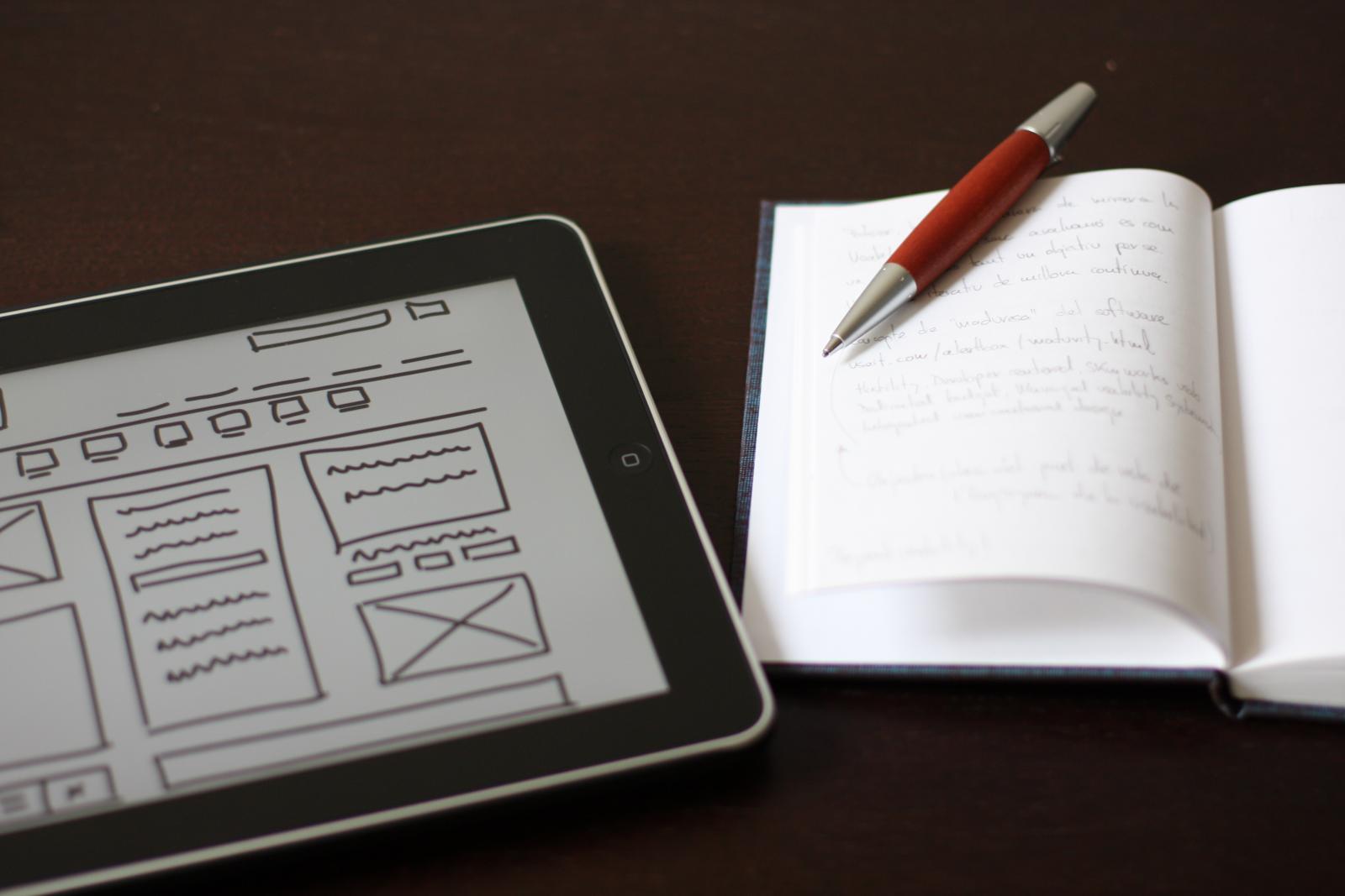
It’s the beginning of a new project.
You’ve got all these ideas bouncing around your head, but they’re too incomplete to express clearly. What do you do?
Same thing you did in school — grab something to write with and some paper (or a whiteboard, or a cocktail napkin) and sketch out what you’re thinking.
In the early stages of design, sketching helps take our abstract and undefined details and turns them into something real. UX sketches are the earliest foundations we build upon, the bridge between nothing and something.
… but they can always be better, can’t they?
We’ve collected the advice of 5 different UX designers for 5 different techniques guaranteed to improve your UX sketching.
UX Consultant David Mannheim’s process of structuring sketches starts by writing out the user problem. He then draws on his experience with other interfaces to determine how to solve the problem.
Knowing this, the lo-fi structure starts to fall into place.
Mannheim, a sketching enthusiast in general, likens digital design structure to classic cartooning. You first outline the navigation menu and the main content, the basic outlines of the cartoon’s head and body. Only later comes the secondary content and details, the arms, legs, and facial features.
He also recommends using the age-old golden ratio, 1:1.6, a “gold standard” of aesthetics for over 4,000 years. Try sketching out the golden ratio first, and then drawing your ideas on top of it for guidance.
Following the golden ratio, the main content area might have 640px and the sidebar 400px.
Sketches don’t need to be perfect, but they shouldn’t be sloppy either.
Senior UX Specialist at Universal Mind, Peiter Buick recommends sketching in layers using a darker instrument for each successive layer. This is an efficient approach to sketching:
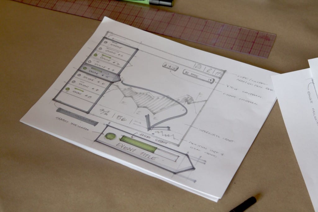
Photo credit: “The Messy Art of UX Sketching.“ Peiter Buick. Smashing Magazine.
Buick suggests starting with a light-gray marker, 20-30% gray. Depending on how many layers you intend to create, incrementally increase the hue of the instrument.
When you’re ready for the final details, use a 60% gray marker or comparable instrument.
This advice isn’t just for sketches, but for all aspects of the design process. The mobile-first approach explained in UX Design Trends 2016 starts with the smallest screen and works upwards, typically something like mobile => tablet => desktop.
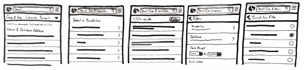
Adam Fairhead explains why this approach just makes sense:
The goal is for your site to look good on all devices, but designing first in a larger screen tends to make mobile versions seems like a “lesser” version of the “original.”
All for free
Download ‘UX Design Process Best Practices’ FOR FREE!
Even the most realistic sketches of screens still only represent the visual dimension and say nothing of interactivity or flow. To properly set the context of usability — which isn’t easy in this early stage — Marcin Treder advocates building a simple paper prototype.
Cheap, fast, and disposable, paper prototypes are great for early stage concept testing. If you’re looking to move beyond paper and build fully interactive prototypes, Adalo offers a no-code app builder that lets you design and test database-driven applications without needing developers.
Simply sketch each screen and put them in order. You can then test your paper prototype with users as a team member acts as the human computer to switch through screens.
UX Designer at Tradecraft, Molly Inglish describes a useful collaborative sketch activity.
The 20-minute Whiteboard Design Challenge is a regular training regime for improving problem-solving skills, building team unity, and even refining sketching abilities.
It works like this:
Inglish swears that engaging in this activity once a week drastically improves problem-solving skills.
For more tips and techniques building functional design systems, check out the free Practical Interaction Design Ebook Bundle. The bundle includes 3 ebooks on wireframing, prototyping, and mockups. 350+ pages of advice are included based on analysis of techniques from Apple, IDEO, Zurb, and Google Ventures.
UXPin is a product design platform used by the best designers on the planet. Let your team easily design, collaborate, and present from low-fidelity wireframes to fully-interactive prototypes.
Ebooks

Build production-ready, code-backed prototypes by syncing your design system to UXPin and adding real props, states, logic, and data.

Prototype with real React components via UXPin Merge—sync props, tokens, and interactions to reduce rework and align design with code.

Compare workflows and migration steps when moving from Figma to UXPin, including design systems, Merge, and rebuilding interactions.